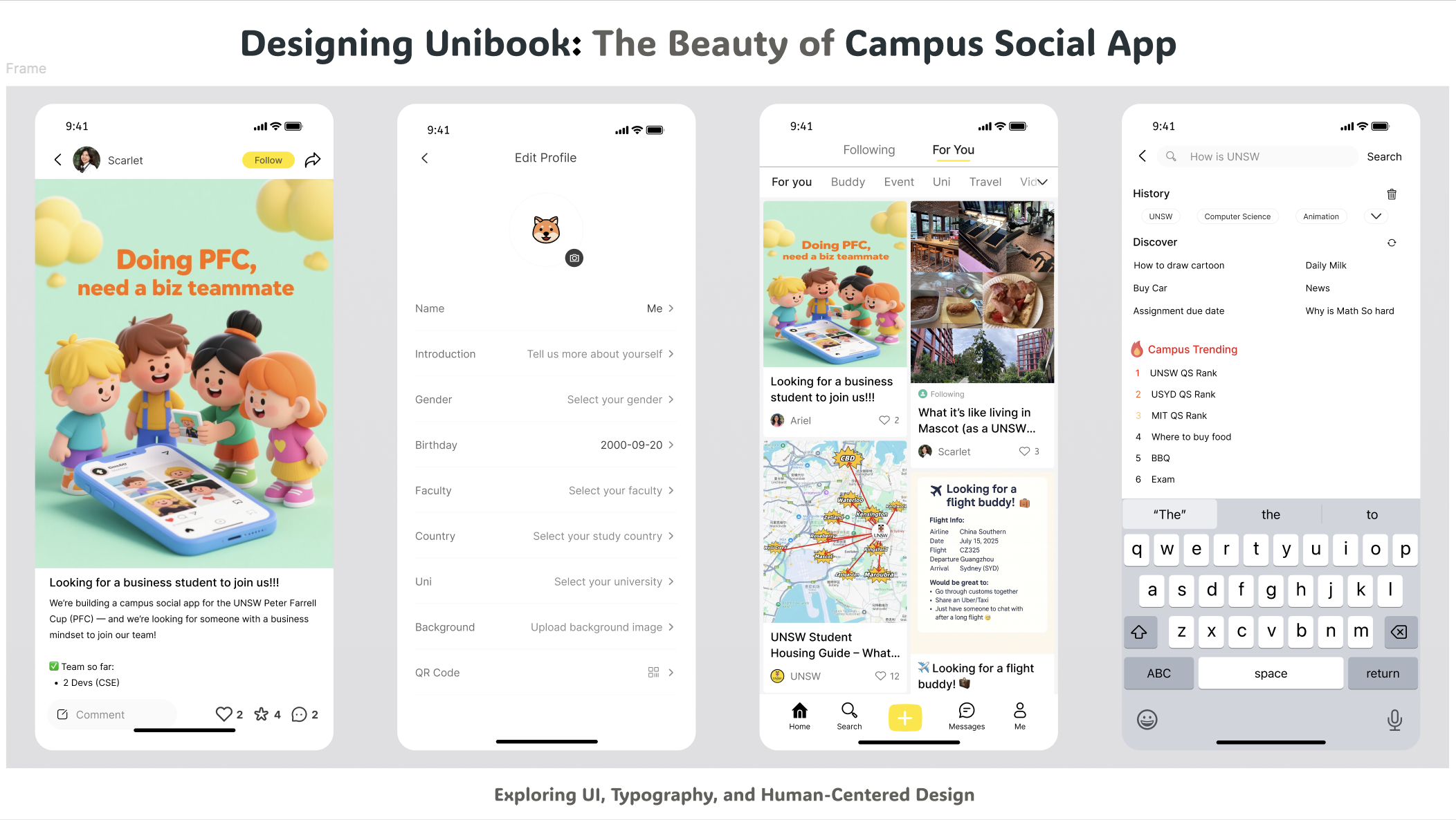
When we started designing Unibook, we quickly realized that color was not just decoration. It’s the very first thing students notice when they open the app. Before they read a single word, the colors already tell them how to feel. 🤩 Do they feel welcomed? Do they feel stressed? Or do they feel excited to explore? 🥰。
Why Yellow?
For Unibook, we chose yellow as the highlight color. It’s cheerful, optimistic, and full of energy—the same reason why brands like McDonald’s, Snapchat, and IKEA use it. Yellow has this unique power to feel both fun and inviting.
On campus, where students are often looking for connection and belonging, we wanted Unibook to feel like a friendly handshake: “Hey, you’re welcome here.” That’s why the most important buttons—the ones that drive action—are in yellow. They grab attention in a positive way, without being overwhelming.
Keeping It Simple: White Background, Black Text The rest of the design stays simple: white backgrounds with black text. This keeps everything clean, readable, and stress-free. Students don’t need to think about the interface; they can focus on the posts, events, and conversations that connect them.
A Human-Centered Approach
From a human-centered design view, this palette does three things:
-
Guides attention (yellow marks interaction)
-
Creates positive emotions (warm, welcoming atmosphere)
-
Builds consistency (students quickly learn what to click)
Why Not Other Colors?
We thought about blue, green, even purple. But they didn’t feel right:
-
Blue felt too corporate and serious.
-
Green leaned more towards health or finance.
-
Purple carried a sense of luxury, but not approachability.
-
Yellow was the one that truly matched our vision of a campus social space—bright, energetic, and inclusive.
👉 Coming next:The Beauty of Unibook Design Vol.2 — Typography & Hierarchy